
-1.svg)
-1.svg)
-3.svg)
%201-1.svg)

%202-1.svg)

-1.svg)

%201-1.svg)


%203-1.svg)

%201-1.svg)
-1.svg)

-3.svg)


The Header: Your Website’s Welcome Mat

The Navigation Menu: Your Site’s GPS

Imagine trying to navigate a new city with a map that’s all smudged up—frustrating, right? A navigation menu is your website’s GPS, guiding users to key pages like “Shop,” “About,” or “Contact” without a hitch. Clear, descriptive labels and a limit of 5–7 menu items prevent overwhelm, while a hamburger menu on mobile keeps things tidy. Adding a search bar within the menu can help users on content-heavy sites find what they need fast. Poor navigation is a dealbreaker—61.5% of users abandon sites because of it, according to VWO. Take Amazon’s streamlined category menu as inspiration: it’s intuitive and keeps users on track. Simplifying your menu with clear labels and a logical structure ensures visitors explore with ease.
The Hero Section: Your Blockbuster Opening

Main Content Sections: The Heart of Your Message
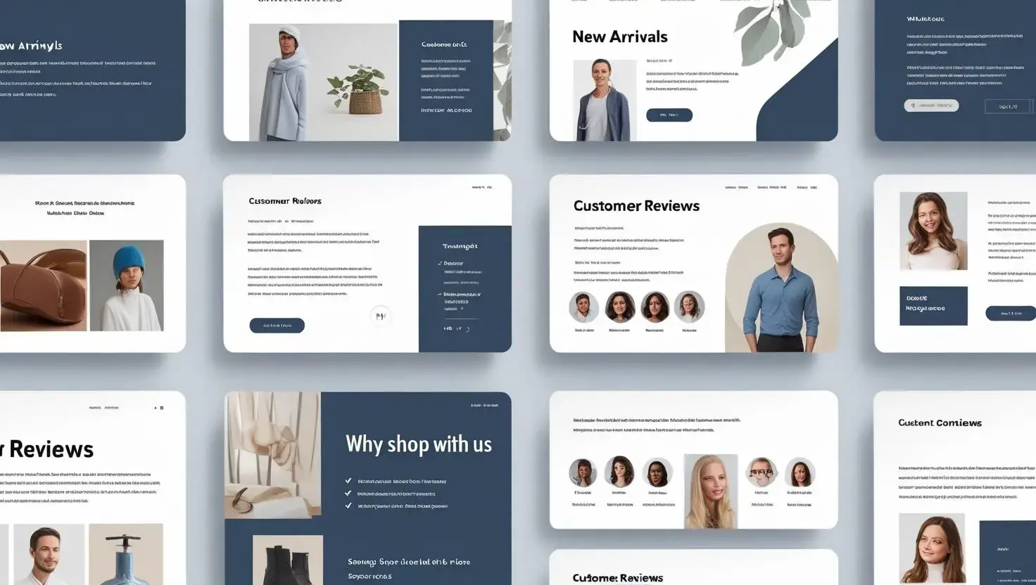
Call-to-Action (CTA) Buttons: The Nudge to Act
%20buttons%20like%20Sign%20Up%2c%20Contact%20Us%2c%20and%20Buy%20Now.%20The%20buttons%20should%20be%20bold%2c%20with%20action-oriented%20text%20like%20Get%20Started.%20Displa.webp)
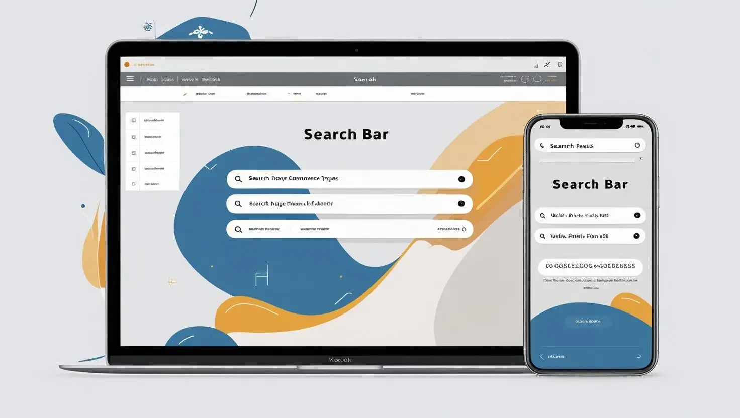
Search Functionality: The Shortcut to Answers
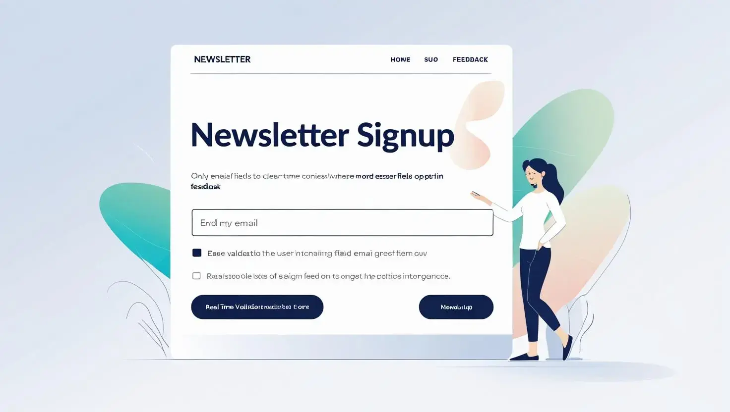
Forms: The Bridge to Engagement
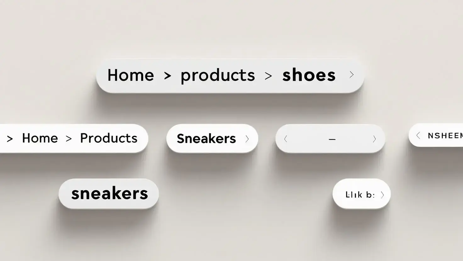
Breadcrumbs: The Trail Back Home
Footer: The Final Flourish
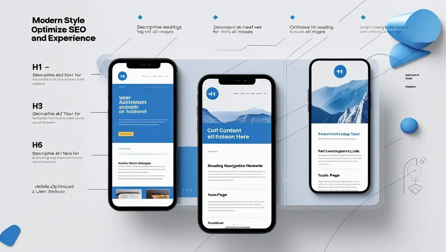
Optimising for SEO and User Experience
Conclusion
Founder & CEO @ Hubxpert. My goal is to make every company using HubSpot succeed in their marketing organisation and automation.

Ratul Rahman
Table of Contents:


Subscribe to our newsletter


HubSpot: Elevating Bangladeshi Consultancies Beyond Excel
Our 2024 Beginner's Guide to Revenue Attribution Models explains key models & helps you choose the right one to optimize campaigns & boost ROI.

Why Bangladeshi Consultancies Lose 30% of Leads—and How to Fix It
Our 2024 Beginner's Guide to Revenue Attribution Models explains key models & helps you choose the right one to optimize campaigns & boost ROI.
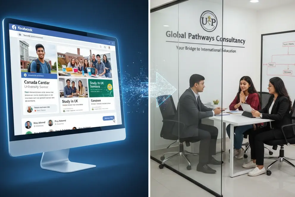
Bangladeshi Study-Abroad Marketing: Converting Social Media into Leads
Our 2024 Beginner's Guide to Revenue Attribution Models explains key models & helps you choose the right one to optimize campaigns & boost ROI.

Best CRM for Education Businesses in Bangladesh
Our 2024 Beginner's Guide to Revenue Attribution Models explains key models & helps you choose the right one to optimize campaigns & boost ROI.

Modern Sales Systems That Actually Convert for Bangladeshi Consultancies
Our 2024 Beginner's Guide to Revenue Attribution Models explains key models & helps you choose the right one to optimize campaigns & boost ROI.

What I Learned Helping Healthcare Businesses Fix Their Sales & Marketing Process
Discover how connected CRM systems like HubSpot can transform healthcare sales and marketing processes, improving patient engagement, reducing no-shows, and streamlining workflows.
-
HubSpot: Elevating Bangladeshi Consultancies Beyond Excel
Discover how businesses are using HubSpot to streamline marketing efforts, boost lead generation, and drive sustainable growth through data-driven strategies.
-
Why Bangladeshi Consultancies Lose 30% of Leads—and How to Fix It
Discover how businesses are using HubSpot to streamline marketing efforts, boost lead generation, and drive sustainable growth through data-driven strategies.
-
Bangladeshi Study-Abroad Marketing: Converting Social Media into Leads
Discover how businesses are using HubSpot to streamline marketing efforts, boost lead generation, and drive sustainable growth through data-driven strategies.
-
Best CRM for Education Businesses in Bangladesh
Discover how businesses are using HubSpot to streamline marketing efforts, boost lead generation, and drive sustainable growth through data-driven strategies.
-
Modern Sales Systems That Actually Convert for Bangladeshi Consultancies
Discover how businesses are using HubSpot to streamline marketing efforts, boost lead generation, and drive sustainable growth through data-driven strategies.
-
What I Learned Helping Healthcare Businesses Fix Their Sales & Marketing Process
Discover how businesses are using HubSpot to streamline marketing efforts, boost lead generation, and drive sustainable growth through data-driven strategies.